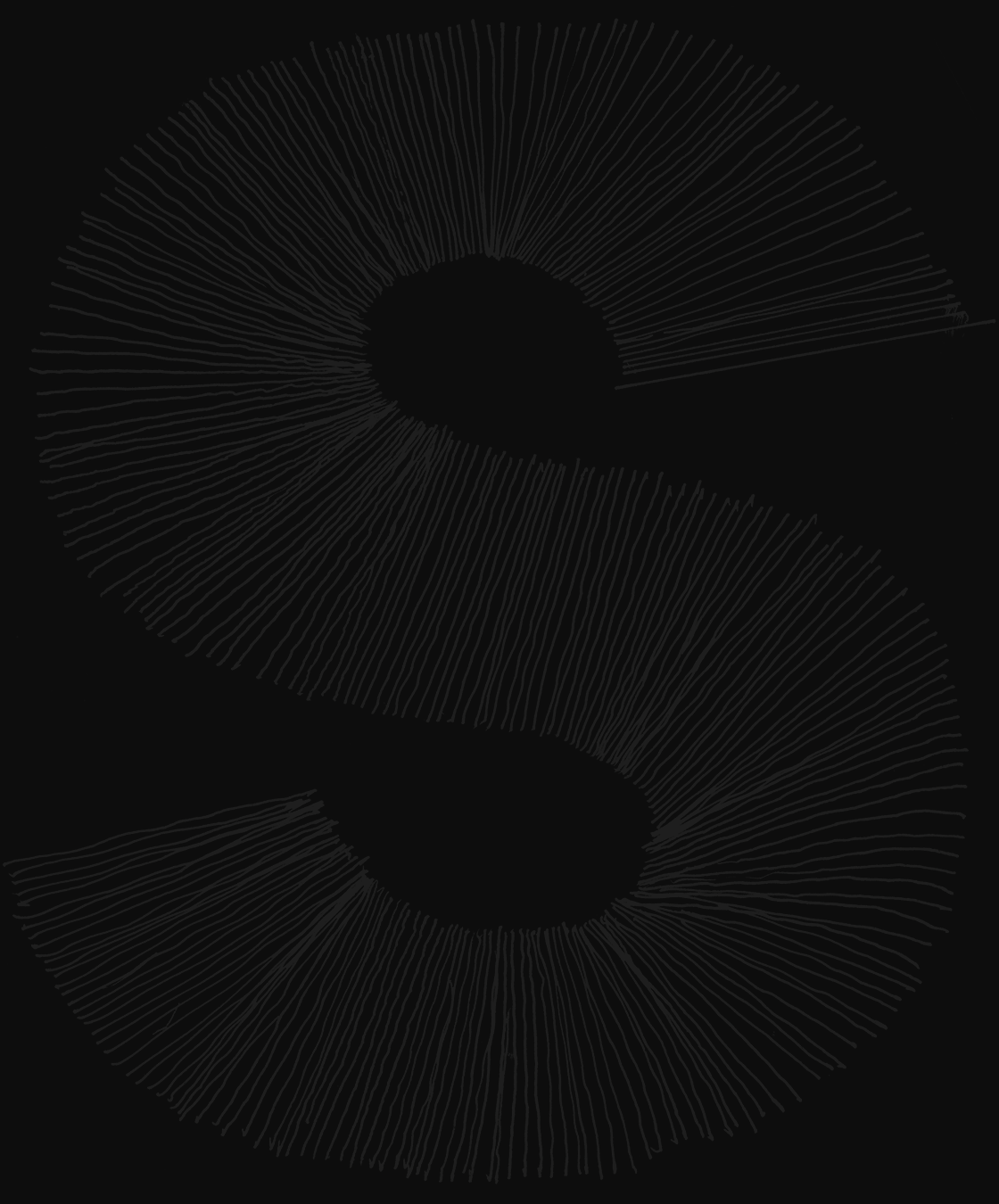
Erik will introduce two small reseach projects. The first: some things to keep in mind about when drawing small details: type for reading sizes is designed to be at the edge of the average eye can see. But what does that mean - and look like? The second: the absolute precision of our digital tools does not mean we all draw the same. The results of a survey.
type, reading, optics, digitisation
Erik van Blokland runs letterror.com, a small font foundry (FontFont, House Industries) and a typographic design studio. He develops niche tools for type design and font production and has been involved in the development of the UFO (for font sources) and WOFF (for font binaries) formats. He is a senior lecturer at the TypeMedia master at the Royal Academy of Arts in Den Haag.